对于一篇优质的论文而言,除了好的idea之外,好的绘图可以给人眼前一亮的感觉,让审稿人和读者一下子就可以记住你的论文和实验结果,为论文接收和被他人引用创造机会。
现在市场上的绘图工具很多,MATLAB, OriginLab, SPSS等。无一例外,提到的都是闭源的商业软件。而Python和R语言使用默认设置绘制的图都多多少少有些。。你懂的。各类设置可能对初学者不太友好,在这种情况下,使用SciencePlots可以减轻你的负担,绘制的插图也看得比较舒服。
SciencePlots是一个专门为科研论文打造的轻量化的绘图工具包,安装SciencePlots最简单的方式是使用pip,使用的指令为:
# 安装最新版
pip install git+https://github.com/garrettj403/SciencePlots.git

# 安装稳定版
pip install SciencePlots
同时,该包使用 $\LaTeX$ 渲染,需要自行安装相关的LaTex支持包,比如,Windows端推荐使用MikTex
安装完成后,使用SciencePlots也非常简单,只需要导入matplotlib工具包,选择相应的style即可。
例如,如果想要给Science投稿,那么只需要引入下列的主题:
import matplotlib.pyplot as plt

plt.style.use('science')
如果想使用IEEE格式,则只需要:
import matplotlib.pyplot as plt

plt.style.use('science', 'ieee')
但是需要注意的是,IEEE的格式会覆盖一些Science的风格,例如列宽,行距等。
接下来,用一些例子来展示一下SciencePlots的用法和具体的效果,首先,引入一些初始的数据并进行绘制。
import numpy as np
import matplotlib.pyplot as plt

def model(x, p):
   return x ** (2 * p + 1) / (1 + x ** (2 * p))

x = np.linspace(0.75, 1.25, 201)
如果不使用SciencePlots, 使用Matplotlib:
fig, ax = plt.subplots()

for p in [10, 15, 20, 30, 50, 100]:
    ax.plot(x, model(x, p), label=p)

ax.legend(title='Order')
ax.set(xlabel='Voltage (mV)')
ax.set(ylabel='Current ($\mu$A)')
ax.autoscale(tight=True)
fig.savefig('./fig1.jpg', dpi=300)
则产生的图片是这样的:
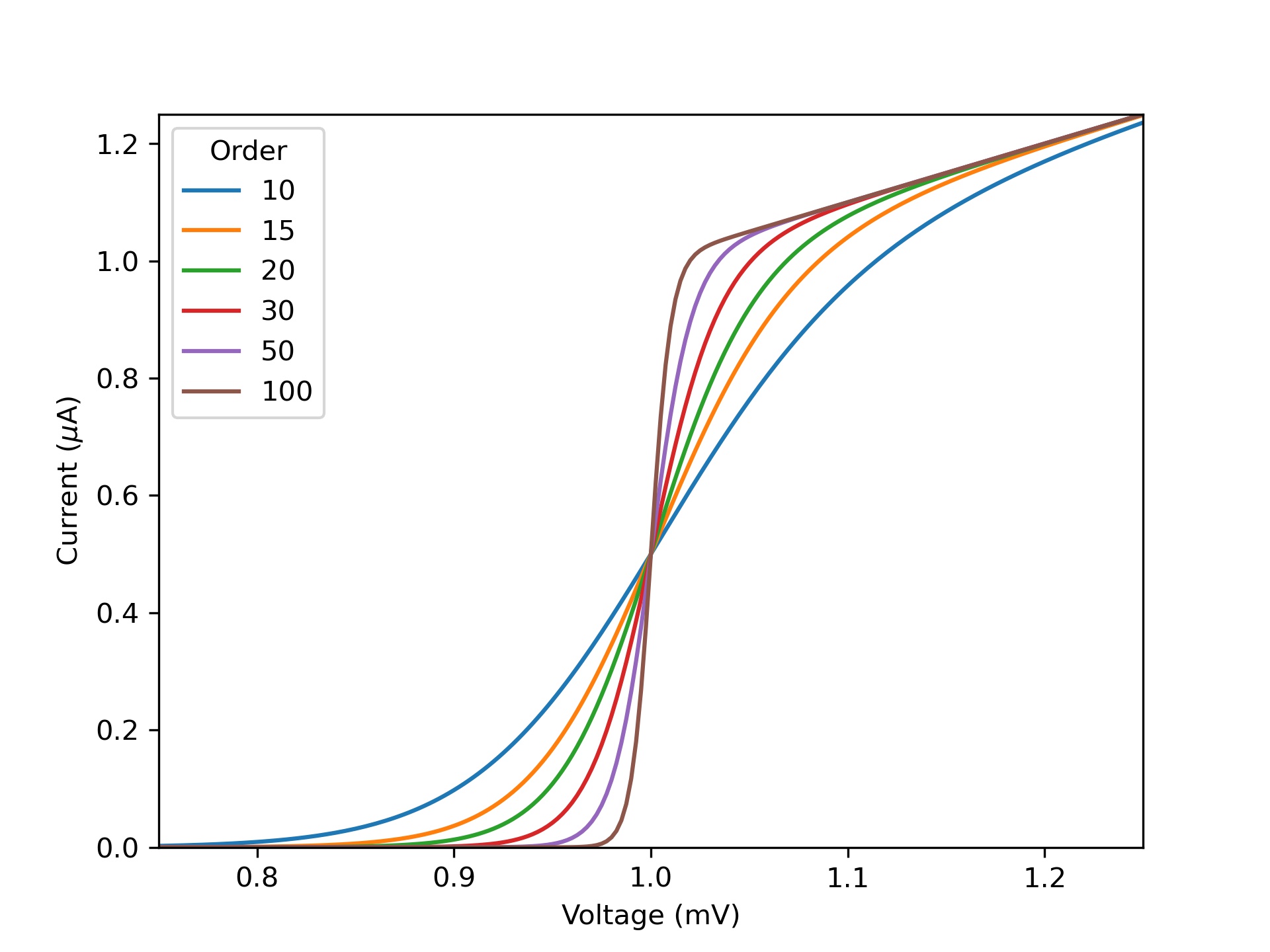 是不是很,,对吧。
而使用SciencePlots的话,则有这样的效果:
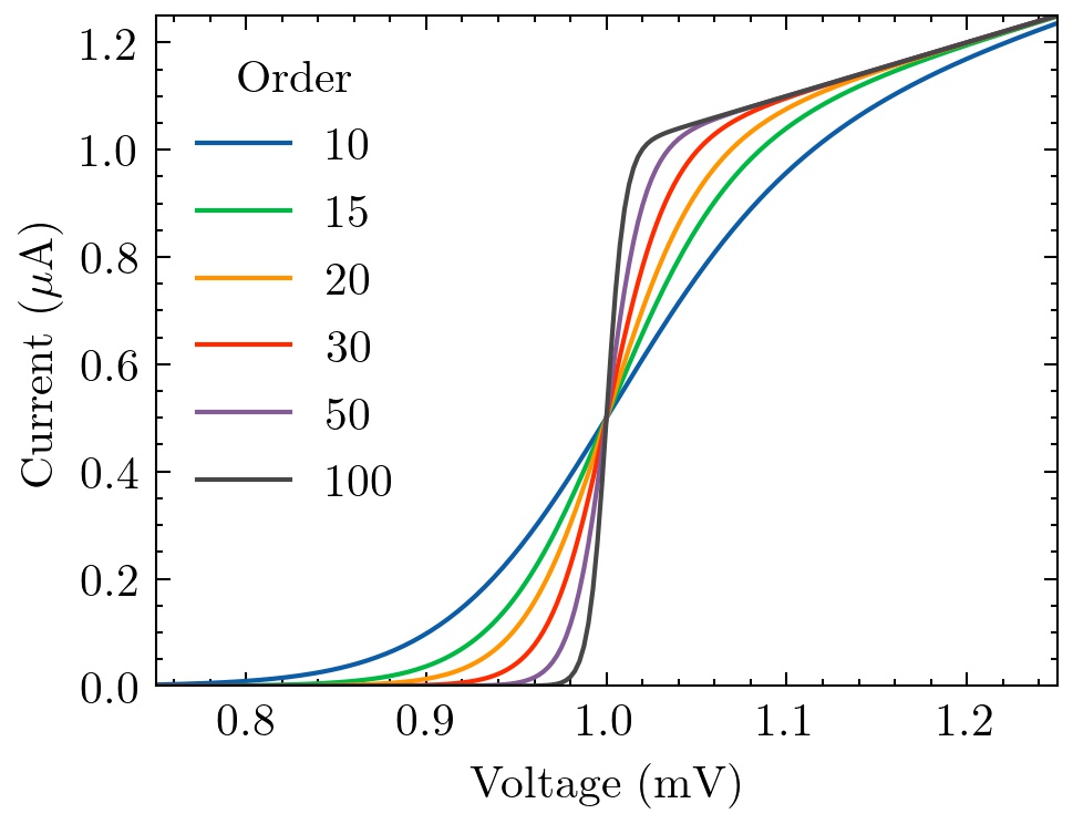 无论是坐标轴的刻度线,字体都变得高大上了很多。
具体是这样实现的:
with plt.style.context(['science']):
    fig, ax = plt.subplots()
    for p in [10, 15, 20, 30, 50, 100]:
        ax.plot(x, model(x, p), label=p)
    ax.legend(title='Order')
    ax.set(xlabel='Voltage (mV)')
    ax.set(ylabel='Current ($\mu$A)')
    ax.autoscale(tight=True)
    fig.savefig('figures/fig1.jpg', dpi=300)
想要了解更多有关SciencePlots的内容,可以去SciencePlots的官方Github了解更多。Github链接
此文就到此结束啦!欢迎大家在评论区留言哦ヾ(^▽^*)))
Ciallo~(∠・ω< )⌒☆
写文不易,如果你觉得我的文章对你有帮助,欢迎打赏!